All work

UX/UI Designer & Graphic Designer · Nov 2019 – Nov 2021

Spark, a dating app for Gen Z

A profile system built on interactive frames so people could show who they are instead of picking the right photo.

Spark app in motion

The story in three acts

01

Act 1 · The setup

Gen Z was bored of dating apps.

117 interviews and a survey landed on the same five complaints: people aren’t serious, matches feel random, profiles are too superficial, and conversations die before they start. The photo-first format itself was the problem.

02

Act 2 · The turn

Replace the photo grid with interactive frames.

Instead of judging a face, users played tiny prompts (Top 3, I Spy, Change My Mind…) that made personality and intent the first thing you saw. 30+ frame ideas, narrowed to 11 through weekly prototype testing.

03

Act 3 · The payoff

2.0 → 4.3 in three months, no paid marketing.

The frames moved the rating, a smart in-app feedback flow protected it, and the Gilroy-based design system and handoff pattern I set up were later adopted by Zoosk and other Spark Networks apps.

What

A Gen Z dating app rebuilt around interactive 'frames', short prompts that let people show personality and intent instead of relying on photos and a bio.

Why

117 interviews and a survey kept landing on the same thing: photo-first profiles felt superficial, matches felt random, and conversations died before they started. The format itself was the problem.

How

  1. 01

    Ran 117 interviews, a 10-question survey and a competitor benchmark to turn pains into job stories and 'how might we' opportunities.

  2. 02

    Mapped the full Awareness to Advocacy journey, including an emotional curve, to spot the moments where the experience broke down.

  3. 03

    Generated 30+ frame concepts, then narrowed to 11 through weekly prototype testing with real users.

  4. 04

    Designed the referral loop and an in-app feedback flow that routes happy users to the App Store and unhappy users to a private comment box, protecting the rating.

  5. 05

    Set up a Gilroy-based design system (atoms, molecules, organisms, templates) plus a handoff and documentation pattern that other Spark Networks teams reused.

Journey map, as-is vs to-be

The same nine stages, two very different emotional arcs.

01

Awareness

As-is: 🤨 Skeptical

To-be: 👀 Curious

02

Consider

As-is: 😐 Unsure

To-be: 🙂 Reassured

03

Sign-up

As-is: 😤 Friction

To-be: Quick

04

Onboarding

As-is: 😩 Tedious

To-be: 🎨 Expressive

05

Usage

As-is: 😶 Confused

To-be: 😀 Engaged

06

Interaction

As-is: 🥶 Awkward

To-be: 💬 Easy

07

Decision

As-is: 😔 Rejected

To-be: 🤞 Hopeful

08

Retention

As-is: 😴 Burnout

To-be: 🔁 Returning

09

Advocacy

As-is: 🤐 Silent

To-be: 📣 Sharing

'Another swipe app, why would this be different?'
'Is this safe? Are people real?'
'Onboarding is endless and asks for too much.'
'Pick six photos and write a bio about yourself.'
'I swipe, nothing means anything.'
'I don’t know how to start, conversations fizzle.'
'Nothing led anywhere, why bother?'
'I open it, swipe a bit, close it, repeat.'
'I’d never recommend a dating app to a friend.'
A clear point of view in the ad and store.
Trust signals before sign-up.
Fast, trustable account creation.
A way to show personality without a portfolio.
Signals to match on, not just faces.
Built-in ice breakers tied to the profile.
Follow-up nudges and intent-aligned matches.
New frames and reasons to come back.
Referral and rating moments that respect both sides.
Lead with the frame system, not the brand.P3
Privacy and intent visible up front.P2
4-step onboarding, social or email.P2
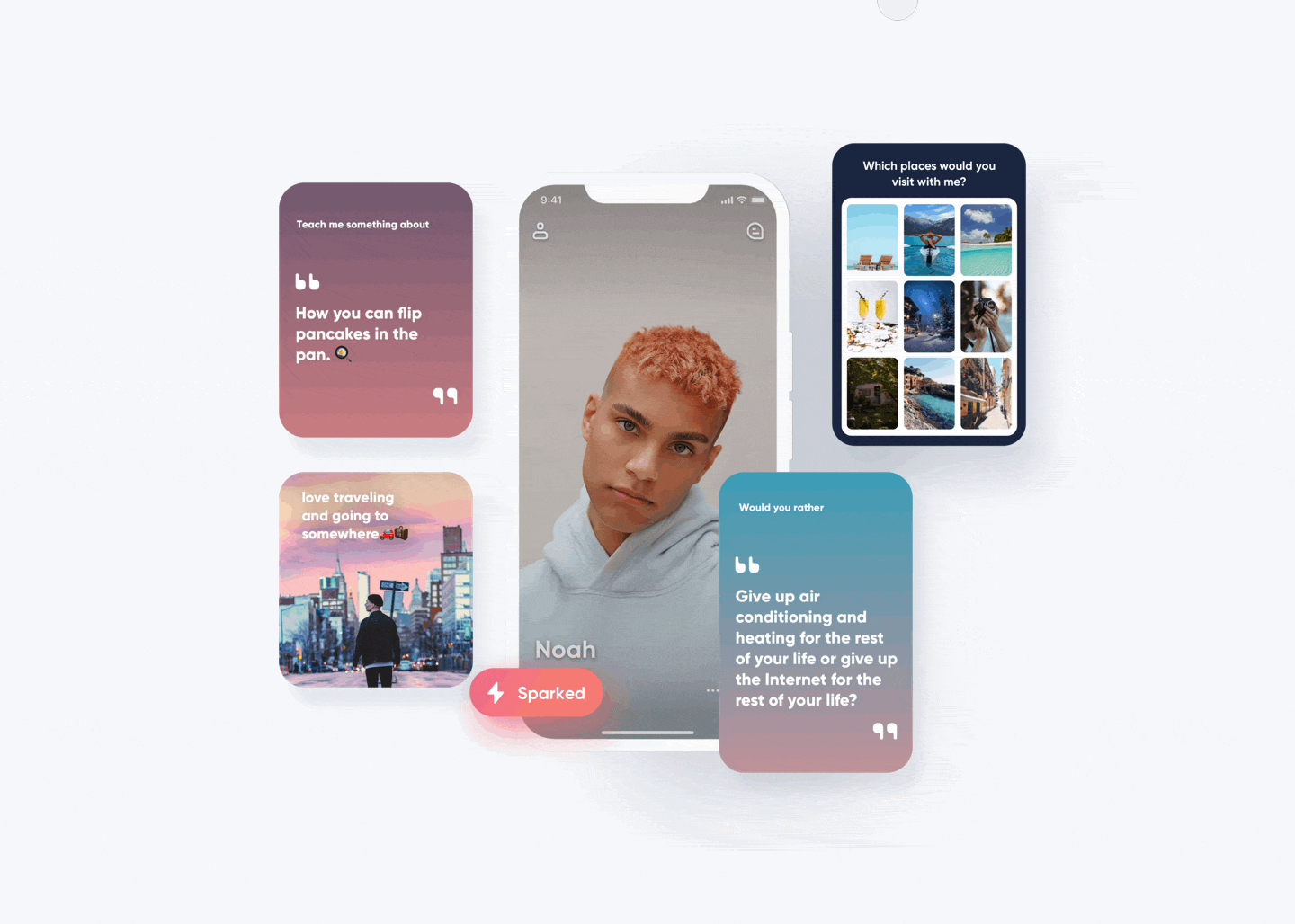
Frames as the primary profile unit.P1
Surface intent and shared interests first.P1
Every frame is a conversation starter.P1
Match on intent, not only attraction.P2
Frames release over time, never all at once.P3
Reward referrals, route feedback by sentiment.P2

Emotional curve

AwarenessConsiderSign-upOnboardingUsageInteractionDecisionRetentionAdvocacy
As-isTo-bePainNeedDesign principle

Dashed grey is the as-is arc, solid indigo is the redesigned to-be arc. The lowest pain moments (Usage, Interaction, Decision) are exactly where the frame system landed.

Measured impact

2.0 → 4.3
App Store rating in 3 months
117
user interviews
11
frames shipped
Organic
growth, no paid
2+
sister apps adopted patterns

What I learned

  • 01

    A small team needs a strong system. The design library was not a side project, it was the only way one designer could keep up with eight engineers and ship weekly.

  • 02

    Documentation travels further than you do. The handoff pattern I set up was reused by Zoosk and sister apps, teams I never met. That changed how I write specs to this day.

  • 03

    Format is a feature. Swapping the photo grid for frames was not a UI polish, it changed what the product was for. The 2.0 → 4.3 jump came from that, not the visuals.